SketchBOX July 2023 & Lord Howe Island

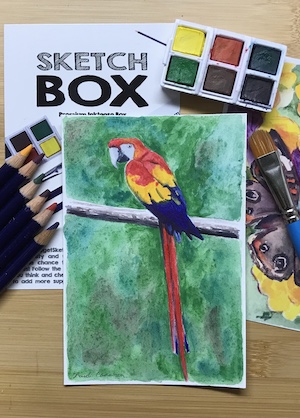
Initially, I wasn’t sure if I was excited by the July SketchBOX contents or not. I have plenty of portable watercolour sets, water brushes and water soluble pencils and don’t really need more. But then, the reason I have plenty of watercolour sets is I am a sucker for them and the SketchBOX Signature one certainly looked very portable and had good colours. While I have one quality watercolour grade hardcover travel sketchbook already there’s always room for another.

Possibly my hesitation was because July is winter in Australia. Melbourne’s winter is for the more dedicated urban sketcher, and I have not even managed to become a fair weather urban sketcher. Painting with the art society, visiting my mother in aged care and seeing friends was taking up most of my energy, so it wasn’t likely I’d be making a start soon.

Then my mother passed away and things got busy and stressful and I found myself longing for a holiday. We’d abandoned plans for an interstate car trip in Autumn because her health was deteriorating, but now we were free to travel I was too drained for something that adventurous. I just wanted to sit on a beach, read, and maybe do a small painting if I felt up to it.

So we went to the travel agent who was our hero when lockdowns forced the cancelation of a big Europe trip, with nine days until the start of the week we wanted to travel and a vague idea that Lord Howe Island would suit.

It did. There was only one accommodation venue available, but it was the off season and a room was available. So we took our first flights since 2019 and found ourselves in Paradise.

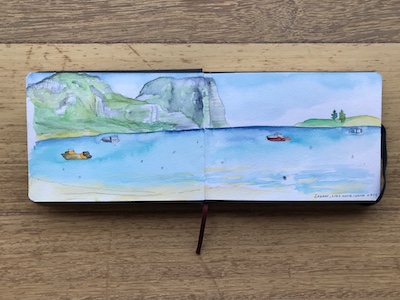
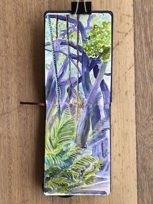
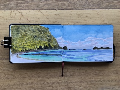
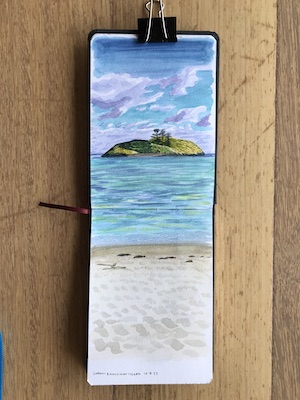
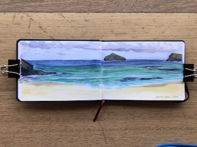
Well, Paradise in winter, when it’s too cold to swim and accommodation isn’t built for chilly nights. However, daytime temperatures were ideal for walking, so we did a lot of that. I did get to sit on beaches, read and do a bit of painting, however, so those aims were achieved.

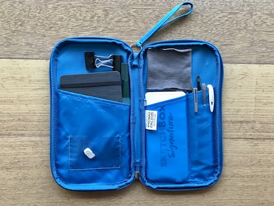
I packed the SketchBOX July supplies, apart from the watercolour pencil (which I was concerned would get jostled about enough to break the lead). They fit neatly into an old travel wallet. The only adjustment I made was sewing along the righthand pocket to make a section that held the watercolour set perfectly. The lefthand pocket was the ideal size for the sketchbook with the water pen tucked in beside it:

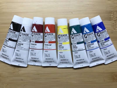
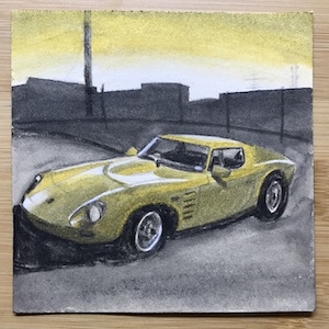
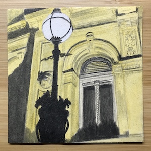
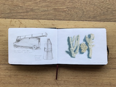
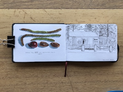
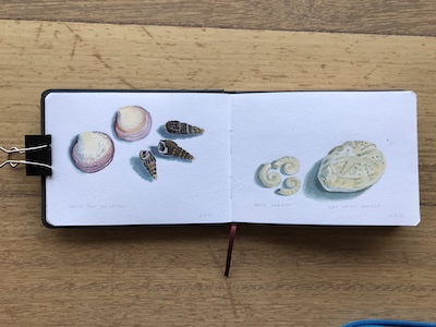
I also took a small plastic box with acrylic gouache paints in it with the idea of painting separate artworks on card, but realised when I got there that most of the plein air painting I do takes two to three hours, and that was a bit much to ask of the other half. Instead I used it back at the room to paint coral, leaves, seeds and shells.

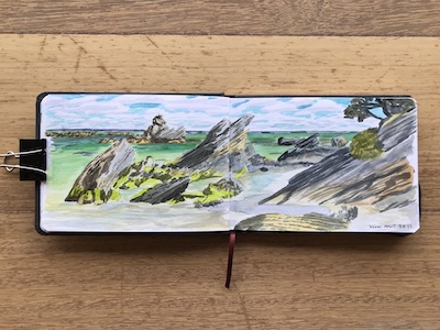
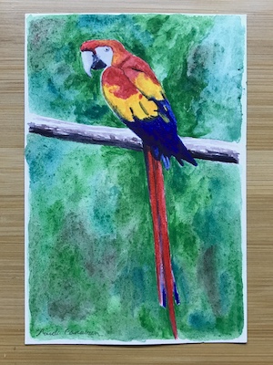
It took me a while to get the hang of the watercolours. Results improved when I worked out that I didn’t like the way water brushes continually feed water into a brushstroke so that the paint dilutes, and makes the whole page more wet than it needed to be. I switched to a normal paintbrush from the acrylic gouache set and was much happier.

Overall, I think it is my favourite of the SketchBOX contents so far. Either this one or the liquid graphite one. When we were considering which island to visit we also looked at Norfolk Island. I’m now keen to go there… but maybe when it gets a bit warmer!

Old Skills, New Mediums

A month or so ago I went to the launch of a friend’s book and talked to a mutual friend who is an editor of a small press publishing venture about my adventures in art. Not long after, she got in contact to ask me if I was interested in doing a book cover illustration for a modern day comic fantasy book based on greek mythology.

When I went through my artwork for the Artist of the Month display some of it was from my days as an illustrator. I felt a mix of nostalgia and curiosity. I’d always wanted to do fantasy book covers, but during the years I ran the illustration business only a few came along, and none for a book. There was an interior illustration of a “friendly dragon” for the children’s education market, black and white internal sf magazine illustrations and one colour cover. I painted cover art for two of my books but my publisher didn’t use them, though they did go on some magazine covers later.

Looking at the art made me wonder if I could try fantasy art again, so my answer to my editor friend’s enquiry was ‘yes!’.

Once I knew what she wanted, and she approved some preliminary sketches, I bought two art materials that were entirely new to me: acrylic gouache and aquaboard.

It might seem crazy to tackle a professional job with a medium I’d never used, but the year of Daily Art gave me confidence that I can work out how to use new mediums pretty quickly, especially if they were similar to what I’d already used. I’d got pretty familiar with both acrylic and gouache during that year. As for aquaboard, I had a small piece from a bag of free art materials given out at an art society meeting, so I had a play with that with the acrylic gouache and liked it.

Both products weren’t available when I ran the illustration business, and they proved ideal for the job. The acrylic gouache dries flat like ordinary gouache, but it can be painted over without disturbing the previous layer. It dries really fast, but the drying retarder I use with normal acrylics worked really well with it. The aquaboard can be wiped almost clean if the paint is still wet, or the paint scratched off if it was dry. All these qualities allowed for the sorts of changes that happen in commissioned illustrations – and I certainly needed them. I wound up scraping off an entire arm and painting it in a new position, and changing the colour of the clothing and skin. I was also able to use the drying retarder as a tinted glaze to change the overall colour of an area.

Some days I had a bit of paint and time left over, so I added some art to my ideas sketchbook – preparing the surface for the cat and dog with gesso.

And I realised that I rather like acrylic gouache. It’s easier to use than acrylic, especially mixed with drying retarder. I wouldn’t say it was better or worse than gouache, because their reactive/nonreactive natures simply means they’re suited to different purposes and styles of working, but I may like it just as much.

In fact, I like it enough to buy a ‘student set’ of smaller tubes to take plein air painting or to still life sessions at the art society. It won’t replace oils, but it would be much easier to pack for a plane trip when I next go on a holiday.

Posted in art

Electricity

When I was nearing the end of the Baroque scarf, I knew I wanted to do more bouclé deflected doubleweave, but I wanted to try using some other other bouclé yarns in the stash. That wasn’t as easy as I hoped. The grey bouclé I’ve been using matched well with Bendigo Classic 3ply, but the other bouclés came in many different weights and it was hard to find nice colour matches.

Then a bright green slubby yarn caught my eye. Not a bouclé but the same WPI as the grey. Being an almost fluorescent shade, it reminded me of electrical wires, which put me in mind of draft I designed after I did the deflected doubleweave Zoom class in 2020. If I recall correctly, I used the snail trails and cats paws overshot profile draft as a DDW profile draft, and electrical plug shapes appeared in the pattern.

So I dug up that pattern and tweaked the colours until I had a trio of yarns that suited… which included the grey bouclé after all. The slubby yarn was a bit thin, but it’s only used for a few stripes in the pattern so I gambled on it not mattering, and that paid off. There was a time I wouldn’t mix yarns that weren’t the same brand and weight. Thanks to the 4 and 8 shaft courses, those days are long gone.

I love how this came out. It’s unisex, cosy and striking. And I’ve wound a warp for another DDW scarf, this time using two other bouclé yarns from my stash.

Artist of the Month

Recently the art society I joined last year asked me to be their Artist of the Month. This is a ‘getting to know you’ exercise rather than a merit award, but still flattering to be asked. It involved hanging examples of my art and writing a short bio. Easy peasy.

Or so I thought. Turns out, I had artwork stored in five different rooms of the house. It included a small amount of surviving school work (almost every place I’ve ever lived has flooded or sprung a leak right where I stored my artwork), work from when I ran an illustration business, many years of work (mostly oils) made in workshops, a whole lot of life drawings, and the Daily Art works that haven’t yet found a home.

When it comes to framed paintings, I have either my favourite work (which I don’t want to let out of the house) or the least successful pieces of those worth framing. I’ve been better at selling or giving away art than I realised – and the portraits I did all went to the sitters. All this mades it difficult to gather a set of work that was good enough to display. In the end I chose one favourite figure painting because it is huge and will take up 1/3 of the space, an animal painting, a portrait loaned to me by the sitter, some life drawings, some Daily Art pieces and a recent still life.

In the process I did a some tidying up and a bit of culling. Mostly from the big pile of life drawings.

I found the first, and only, self portrait I’ve ever made. I was 14-15 years old.

Paul made me a folio holder on casters many years ago. After going through all my art I asked him to add shelves at the base for smaller pieces like Daily Art and still lives.

So participating in Artist of the Month had an extra benefit – making me get all my old and unframed art organised, locating some pieces I’d forgotten about or hadn’t seen in a while, and nudging us into updating the art storage.

Posted in art

Baroque Scarf

I’m not sure why the first word that popped into my mind when I considered what to call this scarf was ‘baroque’, but when I did a google image search on the word plus ‘patterns’ lots of diamond shaped repeats in blues and grey/silver or gold appeared, so my subconscious seems to know what it’s talking about!

Technically, this is another sampler scarf. I want to see what the same yarns I used in the last scarf will do if I reduce the blocks to four ends, and if the floats weren’t overly long I might head down the route of making a garment.

Since it had been six months since I’d put a warp on a loom, my mind felt oddly stiff, as if I was waking up unused muscles. Fortunately, everything I needed to know came back to me and I was soon weaving again. A couple of weekends later it was done.

And I had come up with two more projects. Both scarves. One using the grey boucle, the other using a coppery-brown and an orange boucle. Seems I forgot all about making a garment. Well, I have enough garments. I’m on a roll with these deflected doubleweave scarves. A slow roll, but a roll nonetheless. Let’s see how far it carries me.

SketchBox June 2023

It was a surprise when the June Sketchbox arrived on the 2nd, because the previous two boxes had arrived in the middle of the month. I don’t know if it was due to the Sketchbox organisers sending the international subscriber’s boxes out early or the couriers being extra efficient, but I was certainly delighted to receive it around the same time as other subscribers.

The only down side was that I’d just opened the January one and was still testing out it’s contents, so I waited a week before opening the June box. Initially the box seemed similar to the January one in that they both contained brightly coloured ink, but that’s the only way they were alike. June’s box contained reactive inks.

Unlike the permanent Inktense inks, the Hero Arts inks are meant to rewet, mingle, bloom and bleed. And they certainly do. The sampler I made didn’t hint at how much more reactive they could be.

The behaved themselves in the first artwork – leaving a gap between the background and the objects was a design decision that turned out to have an extra benefit.

It was only when I painted these marbles that I experienced some dramatic bleeding when one colour met another, even when the earlier colour had dried. Fortunately, the marbles were small and have no precise internal edges, so it didn’t matter.

I don’t see this volatility as a fault. It could be rather thrilling in the right situation. I know how it behaves now and can take advantage of that. Which is what I’m enjoying most about getting and exploring these subscription boxes.

The paper in this box is my favourite so far, because despite painting the entire sheet for the lorikeet artwork it stayed perfectly flat. Not the slightest buckle. I want more! The brush was excellent. I’d never normally consider outlining with a pink fine liner, but the Copic pen looks great. The white gel pen didn’t make a completely opaque line, but it was kind of cool how the colour underneath stained it. I used it four ways: as a correction fluid on the white surface, multiply coats to make white highlights, a single coat to lighten an area, and as a barrier layer to stop a new layer of colour bleeding into the one underneath.

I had subscribed to a three-month subscription, but since I’m having fun trying products that are new and/or new to me, I’ve let it tick over into another three month block. It’ll be interesting to see what comes in the next boxes – and if they’ll arrive at the start or the middle of the month.

Posted in art

Saleability

Looking over all the Daily Art pieces and considering what was worth framing had me thinking about what sort of art might sell. Recently, I refreshed the items I had for sale in the Guild shop and that got me thinking along similar lines.

Of the six items I put in the shop six months ago, two sold: a pink flannelette rag rug and a grey and white shadow weave cotton scarf made from the extra yarn in a kit. The four items that didn’t sell included a black t-shirt fabric rag rug with a multicolour twill warp and three cotton twill scarves. I couldn’t help but note that all the scarves had been stashbuster projects and wonder if my intention in making them was weighted too much toward using up the yarn than making something saleable. Perhaps I would have been better off culling those yarns.

I also noted that those four items weren’t my best pieces in the “to sell or gift” chest. When I considered which items to put in the shop this time, I put the nicest ones back in case I needed them as gifts. That is silly. It’s not like I give handwovens very often. So I’ve decided I will take the best pieces for the shop in six months. I only waste my time and fail to make space for new creations if I sell nothing because I didn’t put the good stuff in!

However, I do stand by my decision to keep the nicest flannelette rag rugs. They took a ridiculously long time to weave and in these tough times I doubt anyone would be willing to pay even a quarter of what they’re worth. Eventually mine will wear out and I’ll have something to replace them with.

SketchBox January 2023

Why am I writing about an art materials subscription box from six months ago? Well, waiting two weeks for the April one to arrive had me feeling a bit twitchy and impatient, so I figured if I ordered one of the previous boxes it would arrive right at the start of May, and distract me from the wait for May’s one.

Best laid plans, as they say. According the the tracking, the extra box didn’t ship until after the May one did, and yet the two arrived together mid May. So I decided to save the January one for the start of June, to keep me entertained until the June box arrived. Of course, the June box arrived two days after I opened the January one. By then I was pretty busy, so I waited another week before opening that one.

January’s box is all about Inktense products: pencils and paint pans that are water soluble when you apply but permanent when dry. It’s an appealing idea, especially for making a wash that, once dry, doesn’t shift when you overpaint it. Though I’ve done this with the acrylic inks that came with the Paletteful Packs box, bottles aren’t as portable as little paint pans.

I have to admit to being sucked into the internet culture surrounding these boxes, from watching YouTube videos of unboxings and testing to trying to take nice photos of the contents and the art I made and posting them on Instagram.

But by doing so, I’m learning about art materials that I probably wouldn’t have tried otherwise. The Inktense pans came up quite dark in my swatch and yet when I used them on the background of the bird painting they dried paler than I expected. The Inktense pencils, however, laid down intense pigment that stayed so when water was painted over them. I wound up layering pencil over paint. Which was a faster way to fill the background than colouring it all in with pencil then painting over it.

The paper buckled with use, but then watercolour paper does that if not pre-stretched. I didn’t like the brush – not even for the background – so only used it for the backgrounds. I tried applying masking fluid for the white spots on the mushrooms and was pretty happy with the result.

I can see myself using these products again, probably for laying down backgrounds in watercolour sketches. Maybe also for initial water-soluble guidelines, and when I need to quickly intensify colour in an area. Definitely worth adding to my travel sketching kit.

Posted in art

Coiling

We signed up to a streaming service recently, which has given me a rich vein of art and handcraft reality tv programming to binge. I’m not normally a fan of reality tv, but I love the Great British Bake Off, the Great British Sewing Bee, Good with Wood and Portrait/Landscape Artist of the Year. It turns out there is another show in the same vein: the Great British Pottery Throwdown.

I learned pottery between ages 6 and 12, then later it was included as part of my secondary education when I was 16-17. The last time I did any was in my 20s, when I did a terracotta sculpture short course. I had an idea that I would do it once every decade of my life, but my 30s and 40s passed by without me getting my hands covered in clay, and it’s doubtful my back would cope with it now.

So when the show gave me an itch to play with clay, I turned instead to coiled basketry.

This has many advantages. It’s entirely made from recycled materials – strips from old denim jeans leftover from weaving rugs and cotton thrums. It’s portable – I’ve been doing it while visiting Mum in aged care. There’s no need to find a kiln for hire. The materials produce only a little dust and don’t require safety equipment. You can take your time and it doesn’t dry out. And if you drop the object you’re making, it doesn’t shatter.

I had no idea what I was making when I started; I just coiled and sewed until I ran out of denim strip and found I had a little basket. Then I started another. That became a lid.

I’ve started another piece. This time with black denim and blue thread. So far I have a growing disc. I’m thinking maybe it’ll become a trivet or a wide bowl, but in truth I’m happy to let it become whatever the moment leads it to become.

SketchBox May 2023

Having seen unboxing and testing videos of May’s art supplies, I was keen to try them, but I knew the box wouldn’t arrive until mid-March. A week before, I started picking reference photos from my phone and tested drawing the subjects in pen and watercolour marker. Of course, when it did arrive I was already ‘over’ those ideas and entirely different photos caught my attention.

The box contained graphite pencils, a white pastel pencil, liquid graphite and a lovely warm gold glimmer ink. There was also a pad of toned paper, a sharpener, a brush and an eraser pencil. The only supply I didn’t like was the eraser pencil, which was rather hard and scuffed the paper surface, so I used a standard eraser instead.

The first artwork was of a cat stretching, because it captured the feeling of “gimme, gimme right now”.

It didn’t come as well as I hoped, but it gave me a feel for the materials and taught me to avoid drawing with pencil until the ink or graphite was well and truly dry. Two days later I had a bit more time and did three pieces that I like much more. The suggested theme was “shadow”, so I looked for reference photos that might suit. The first was of our cat gazing out of the window. Most of it was drawn with pencil, with the liquid graphite added for the deepest shadow on the cat and day bed, and of course the glimmer ink watered down a little.

Then I found a reference for a sports car. After an initial sketch with pencils, I explored mixing the glimmer ink with the liquid graphite. It makes a useful greenish tone. By diluting, layering or mixing the graphite, ink and white pastel I could get quite a range out of what was a quite limited colour palette.

And finally, I tackled one of a heritage building at night. This took the longest, because of all the decorative details. The darkest areas are painted with liquid graphite – even the 14B pencil couldn’t approach it in blackness. I diluted the glimmer ink quite a bit to get more of a yellow shade than shimmery effect on the stone walls. The white pastel was used only on the light, and love how it conveys the glow.

Overall, this was a much more ‘arty’ box of materials, and much easier to use, than the previous box. I can see myself using everything in it again. Even the eraser pencil, which might prove more suitable on a different, stronger ground or be good for tweaking the surface colouring on a sculpture. My favourite was the liquid graphite, but I was most surprised by the versatility of the glimmer ink. SketchBOX have hinted that the next box will contain them, which I would very much like.

Posted in art