Norfolk Island

A few months back, when we were considering where to go for a week’s holiday, one place we looked into was Norfolk Island. While chose Lord Howe Island, the idea of going to Norfolk Island still appealed, but weren’t getting around to arranging a trip. Then one day I did a search for “artist holiday Norfolk Island” and the first link that came up was for a watercolour painting trip in October.

Almost everything was included in the package – I just had pay for one leg of the flights and organise insurance. It was nice not to have to do a lot of research and bookings, and assume that the artist would have vetoed the accommodation. Paul was okay with coming along on a holiday where I’d be painting a lot, since the teacher would know where all the nice views were that he could photograph, and he could take our car and go exploring if he wanted to.

The first day we went out painting, it started to rain. We retired to a function room at the accommodation to finish our paintings from photos. The subject was Bloody Bridge:

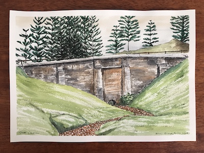
Despite the name, that isn’t gore in the creek but a water plant that had died due to lack of water, which seemed ironic considering why we had to abandon the spot.

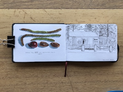
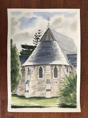
The second location was St Barnabus’ Mission Chapel. It was a windy day, but less so there than in more open areas like the beach:

That night I did a sketch of one of the whale oil lamps in the chapel. It’s sideways here:

On the righthand page I painted a big, rusty buoy at the front of the accommodation.

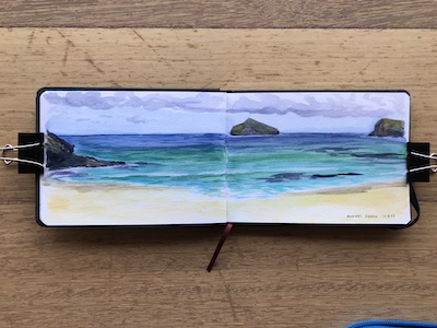
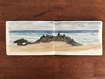
The next location was Slaughter Bay. It was sunny but very windy, so we sought shelter within the penal colony walls. Rather than doing a painting on a board, which would catch the wind, I painted in my sketchbook.

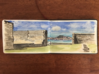
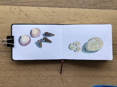
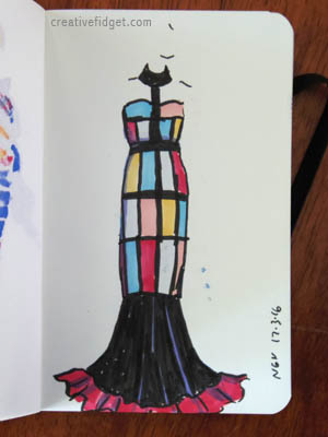
However, the wind played a trick on me, flipping over a few pages without me realising before I slipped them open, which meant I was obliged to fill in three spreads before I left Norfolk Island.

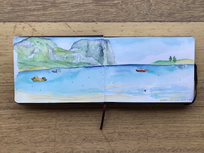
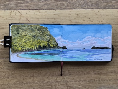
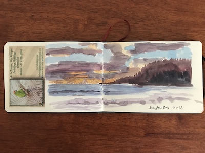
We had an afternoon to spend at the agricultural show, which was fun but didn’t take up the rest of the day so I suggested to Paul that we go exploring. We found our way to Anson Bay, where I found a good, sheltered spot to work.

The water is mostly white because it was so rough it was nearly all foam.

That evening we had a BBQ at Emily Bay. I did a really quick sketch of the sun going down. It was very rushed, what with the light changing and the wind so strong it kept pushing my water cup across the park bench I was sitting on.

The next day, the location Belinda picked was… Anson bay. So to do something different, Paul and I walked down the steep track to the beach, and I painted in my sketchbook.

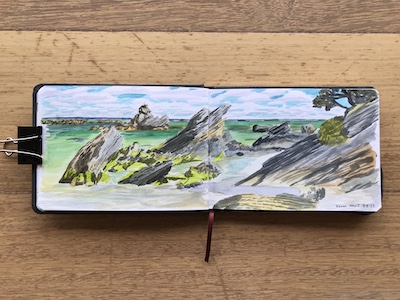
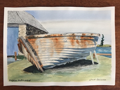
The following day we were back at Slaughter Bay, but this time to paint the rotting boat hulls on the shore.

I was seeing some rather peculiar colours – green shadows and lurid yellow grass anyone? As we headed home I realised I’d had my sunglasses on the whole time. Later, in our room, I over-painted with Ultramarine in the hope of alleviating the crazy green cast.

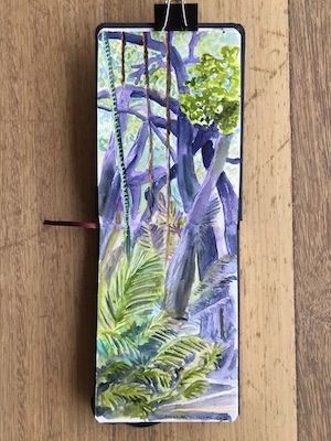
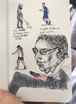
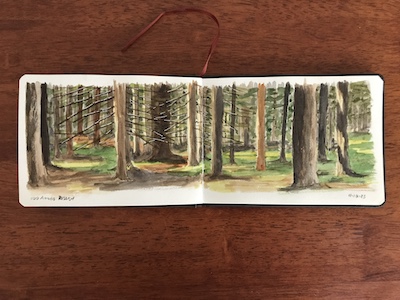
We had a tour and free afternoon the next day. I must have been sitting right over the back wheels on the bus, so ended up with a protesting back and a headache. After a bit of food and a rest, I felt better and decided I needed a walk to straighten things out. We went to do the walk at 100 Acres Reserve, and near the end stopped at a park bench so I could paint a different sort of scene to beaches and historical subjects.

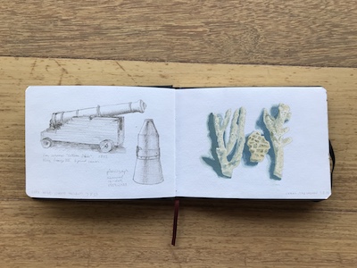
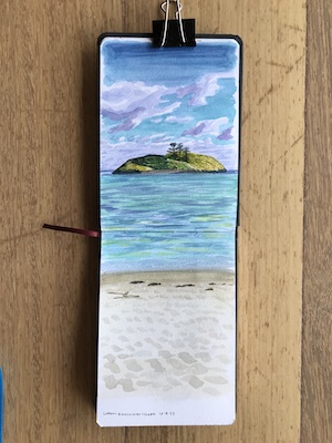
That meant I’d filled the gap in my sketchbook. I could have stopped there, but I did add another spread later. Before then, we had our last painting session at Cemetery Bay:

My aim, other than having fun, was to get more familiar and confident with watercolours so I could do better sketchbook art, and I feel like those last two pieces show some success. I learned some new things about the medium and ways to apply it, like that some pigments are opaque and how that affects mixing, and that watercolour doesn’t have to be all about trying to get pigment to disperse in puddles of water in a pleasing way.

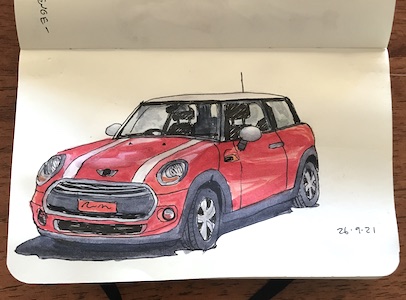
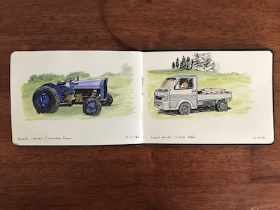
On the day we headed home we had several hours to fill, so I did these two vehicles from photos on my phone. The purple tractor was at a lavender farm, and the mini utes are everywhere on the island:

Overall it was a great trip, and so nice to hang out with a lovely group of fellow artists. Because I was painting so much, Paul and I didn’t get to see all of the island, so there’s more to experience should we ever go back.

I’m finding these week-long trips a nice length – enough for a change of scene but not being away from home very long. We both agreed that we wouldn’t do a package artist holiday together again, but Paul is fine with waiting while I do a spread in my sketchbook on a holiday we arrange and take together, and I am more confident that I could go on artist holidays on my own.

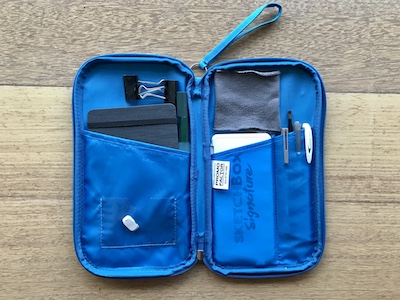
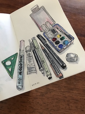
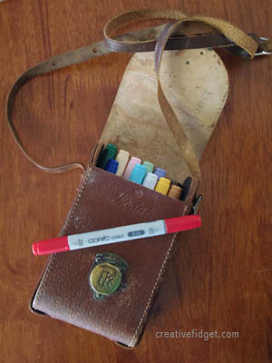
With that in mind I’ve started doing some research into the next island we want to visit. Already, I can see plenty of potential painting locations, as well as more attractions than I realised were on offer. And I’m tweaking my painting kit to take on Belinda’s advice, and a few changes that might make it lighter to carry and easier to use.

SketchBOX July 2023 & Lord Howe Island

Initially, I wasn’t sure if I was excited by the July SketchBOX contents or not. I have plenty of portable watercolour sets, water brushes and water soluble pencils and don’t really need more. But then, the reason I have plenty of watercolour sets is I am a sucker for them and the SketchBOX Signature one certainly looked very portable and had good colours. While I have one quality watercolour grade hardcover travel sketchbook already there’s always room for another.

Possibly my hesitation was because July is winter in Australia. Melbourne’s winter is for the more dedicated urban sketcher, and I have not even managed to become a fair weather urban sketcher. Painting with the art society, visiting my mother in aged care and seeing friends was taking up most of my energy, so it wasn’t likely I’d be making a start soon.

Then my mother passed away and things got busy and stressful and I found myself longing for a holiday. We’d abandoned plans for an interstate car trip in Autumn because her health was deteriorating, but now we were free to travel I was too drained for something that adventurous. I just wanted to sit on a beach, read, and maybe do a small painting if I felt up to it.

So we went to the travel agent who was our hero when lockdowns forced the cancelation of a big Europe trip, with nine days until the start of the week we wanted to travel and a vague idea that Lord Howe Island would suit.

It did. There was only one accommodation venue available, but it was the off season and a room was available. So we took our first flights since 2019 and found ourselves in Paradise.

Well, Paradise in winter, when it’s too cold to swim and accommodation isn’t built for chilly nights. However, daytime temperatures were ideal for walking, so we did a lot of that. I did get to sit on beaches, read and do a bit of painting, however, so those aims were achieved.

I packed the SketchBOX July supplies, apart from the watercolour pencil (which I was concerned would get jostled about enough to break the lead). They fit neatly into an old travel wallet. The only adjustment I made was sewing along the righthand pocket to make a section that held the watercolour set perfectly. The lefthand pocket was the ideal size for the sketchbook with the water pen tucked in beside it:

I also took a small plastic box with acrylic gouache paints in it with the idea of painting separate artworks on card, but realised when I got there that most of the plein air painting I do takes two to three hours, and that was a bit much to ask of the other half. Instead I used it back at the room to paint coral, leaves, seeds and shells.

It took me a while to get the hang of the watercolours. Results improved when I worked out that I didn’t like the way water brushes continually feed water into a brushstroke so that the paint dilutes, and makes the whole page more wet than it needed to be. I switched to a normal paintbrush from the acrylic gouache set and was much happier.

Overall, I think it is my favourite of the SketchBOX contents so far. Either this one or the liquid graphite one. When we were considering which island to visit we also looked at Norfolk Island. I’m now keen to go there… but maybe when it gets a bit warmer!

Using Stuff Up

So I may have mentioned the multitude of jars the workshop required. There came a point around week 6 where I decided I needed to use up paint rather than buy more jars. I dug through my bag of clothes to dye and found two long-sleeved tops that I’d attempted to dye before but wasn’t happy with the result.

Putting my newly acquired knowledge to use, I scoured them first. That removed some but not all of the old colour. Then I mordanted them with gallnut, alum and soda.

In the 6th module we’d made some iron solutions for painting, and the tutors suggested using them up by dyeing fabric. I decided to dye one of the tops, which had come printed with stripes. The white areas came out a nice, soft grey.

The second top had a few indigo leaf prints that hadn’t come out strongly enough to look like more than mistakes. So I lined the inside with paper and laid down lines of narrow masking tape, then painted it all over with the mixed colour dye pastes, figuring that I can always mix up more from the pure colours if I need to in later classes. I had to mix a little bit more of a few colours, but managed to empty six jars overall. The indigo leaf prints still show, but come across as a bit of extra patterning.

Steaming was a challenge. After the top had tried I replaced the paper inside with clean pieces, then rolled the sleeves up first, then the body from the bottom up, and continued by rolling the sleeves inside the body. It needed a few patches of paper where the odd shape made tears and I managed to curl it into a neat but open parcel.

Then I had to buy another level for the bamboo steamer and get Paul to remove the base to make a spacer level. That allowed enough room for the parcel. I dyed it for an hour rather than 40 minutes to make sure the heat penetrated.

When it was done I washed it in warm water twice, but it’s still a bit stiff from the gum. I’m going to let it cure for a few weeks then wash it in soapy water.

I’m pretty chuffed with both of these tops, and was ridiculously pleased by emptying six (SIX!) jars ready for future workshop modules. Painting a whole garment was quite time-consuming and fussy, so I wouldn’t do it except in this circumstance. Much easier to print the fabric then sew the garment.

Flower-a-Day, Week 3

At the beginning of the third week, my friend KRin brought over a rose from a bush given to her to commemorate her late husband. It had an amazing scent of cinnamon, and was a lovely matte orange.

She wanted to watch me paint. Unfortunately, I do find it hard to talk and paint at the same time, and tend to ramble inanely when I do.

As I said in the last post about these paintings, I’m struggling with defining edges and depth. In dim light with a matt single-colour flower it’s hard to see much definition. Though the camera captured the shadows more easily than my eyes perceived them. And I suspect I was at the edge of the capacity of the paint set, too. I eventually outlined the rose with black paint applied with a paintbrush.

A few days before, an order for some Winsor & Newton designer gouaches arrived and I was keen to try them. Especially as I hoped they’d give me the subtle but effective range needed to show depth. Working with a photo of a flower that had the same kind of matte (mostly), single-colour petals, I took my time and I’m pretty happy with the result.

The next day I sat outside and attempted to portray this convolvulus flower. I wasn’t happy with it until I deepened the shadows with black later.

I tried the purple variety the next day from a phone pic.

While it’s very rough, I do feel like I captured the light.

The next day I headed to the native garden. The flower I picked is tiny, and when I found I wasn’t getting much subtlety I decided to approach it as if it were a printed fabric design using only three colours.

I tried the same approach the next day, but the result wasn’t as satisfactory, though perhaps I’d like it better as a fabric design if it the flowers and leaves were more densely packed.

Same area and also a native, but this time only using pencil.

Looking back, I created the best and worst flower art in this week. That tree peony turned out so much better than I expected, using a medium I’m not overly familiar with. But the chocolate lilies disappointed me.

Flower-A-Day, Week 2

On day 8 I tackled another rose, this time using watercolour pencils blended with a little water. I’m not as happy with this one. The rose petals had a pink line around the edges, but in the painting this just looks like a pencil outline.

The following day it was wet, so I painted clivias from the shelter of the desk. I started with the intention of using only paint, but couldn’t get enough nuance from the brigh, saturated colour so delineate the edges, so I resorted to pen, which looks great.

Another day of unappealing weather so I went through my phone pics searching for flowers, and hit upon photos of grass tree flowers on Flinder Island. I enjoyed doing something different. A pale yellow silhouette of the plans went on first, then some green and grey, then I switched to watercolour pencils for the texture, then switched back and forth to get the darks and background. If I’d painted this for a travel diary I’d have been very pleased.

Another photo reference, of the native pigface that grows on the embankment next to the pool. There is no black in the background in real life, but I liked the contrast and drama it created.

On day twelve I drew the flower that identified the Dietes plant that had sprung up among the Dianellas, before getting Paul to dig it out.

Only lucky day thirteen I painted this magnificent rose I’d spotted the day before. It has the most divine scent, despite the unromantic name of ‘stainless steel’.

On day fourteen I popped outside to paint an azalea. The sunlight was quite hot though the day itself wasn’t particularly warm. Unfortuantely, I don’t have the label for this one.

I didn’t use the watercolour pencil until the end, when I added some texture by working into wet paint.

I’m learning something with every flower, whether by making mistakes or trying something new in approach or medium. Portraying depth and defining edges are proving a challenge, but at least I’m getting the flower in the middle of the page now!

Flower-A-Day, Week 1

The sketchbook. Teeny weeny.

For the first flower, I went out into the garden looking for something relatively simple to start with. And accessible. Most of our flowering plants are on a steep embankment, but I found this little nasturtium had sprouted behind a low retaining wall where most of my lavenders died.

I learned two things from this: first to consider carefully if the picture needed a background, second that sometimes you can’t mix a colour and need to add a new pigment to your set. In this case, I brought out the Stuart Semple palette, which had an orange bright enough for the flower. From then on it was my first choice when I wanted to use paint.

Next, the red hot poker had one last flower on it, so I decided to do that before the opportunity passed.

Much happier with this one. I realised that at eye level the tubular flowers rarely come straight at me, but up and down.

Next, I was going to paint bright yellow flowers on one of the natives, but they were already past their prime and their position on the embankment was not going to make for comfortable painting. Instead, I headed for the Unexpected Succulent Garden, which has been looking amazing recently.

I hadn’t intended to add the leaves, but got inspired. But adding them put the picture off balance on the page.

Soon after I started the next one, I went and got a seat. I thought I’d be able to sit on a rock, but I was wrooooong. I got myself a stool.

It really needed a green background to contrast with the red flowers. The paints weren’t getting me the feel of the subtly striped petals, so I ducked inside and got some watercolour pencils.

I’d be happier with this if I’d managed to centre the flowers on the page. I had to look up the name of the succulent and this one, and I was amused to find this one was an African Daisy. A couple of years ago I went looking for African Daisies for the front garden, not realising I already had them in the kitchen garden.

The next day was really cold, so I turned to my iPhone’s photo albums. And I finally managed to get a flower centred.

Again, watercolour pencils made adding texture much easier.

This plant isn’t in flower at the moment. It’s in the giant tongue-like leaves stage. They’ll die off and the plant will all but disappear until the flowers emerge from the ground next autumn, first with bright buds like giant parrot beaks, then opening to make these alien-like flowers.

The following day was lovely for flower painting.

The label stuck into my gardening diary told me this was a Dianthus. It didn’t mention that Dianthus are ‘pinks’, which it turns out is another name for carnations. Now I understand why on gardening shows presenters would sometimes gesture to a bed of not-pink flowers and call them pink.

Turns out the colour pink is named after the flowers, not the other way around. And pinking shears are named after the shape of the petal ends.

This one was quite the research black hole.

The seventh flower was a rose. One of my climbers.

No paint this time, just watercolour pencils without water. It suited the densely packed petals.

Overall, I found that I was always better off trying to painting what I saw, including flaws, rather than ‘fix’ anything or try to ‘just paint the gist of it’. Taking photos and looking at the thumbnails helped to reveal overall flaws too, and a friend’s honest assessment that the carnation looked a bit flat helped me fix the problem.

The painting have taken between 20 mins and an hour and a half. I’m sure I’ll get faster, or at least better at choosing quick subjects when I’m short on time. Though it is nice to spend more time as well when I have it.

The 7 Day Urban Sketching @ Home Challenge

As I’ve mentioned, I’ve been watching lots of fast motion videos of artists working and talking about their methods, and one I stumbled on was a young woman, Taria, who runs the Urban Sketching World website. She had done a series of videos of herself sketching at home during lockdown earlier this year, presenting them as an artistic challenge for others to try.

Having decided I should do some art around the house, this seemed as good a place to start as any. I have a sketchbook I draw and paint in when I go on day trips or weekend away, which I had nearly filled, so this could be a way to finish it off, too. It turned out to have five pages left, so this challenge would not only complete it, but get me started on a new sketchbook.

The first day’s theme is ‘art supplies’. Always fun and easy to depict:

The second day’s is ‘something from the cupboard’. I chose the shelves in the door of our TARDIS liquor cabinet:

The third theme is ‘plants’. I live on an acre with more than half of it garden, from native to vegetable beds. Spoilt for choice there, you’d think. Only it was freezing outside so I brought in this little pot:

Theme number four is ‘modes of transport’. I’m always up for drawing my Mini, and I was fortunate that it was a sunny day:

The fifth theme was ‘the room’. I thought this one would be difficult, so I was thinking about it ahead of time. I settled on the corner of the kitchen:

Day six’s theme is people. Lockdown meant my subjects were limited to me and Paul, but then I remembered that people like to walk along our street and drawing people quickly is an interesting challenge. However, in 1 1/2 hours only four people passed, and one of those I spotted too late. So I started sketching Paul, then realised I didn’t have enough space so abandoned that and drew his head.

For the seventh day we could draw anything. It was a dim, overcast day and it was hard to make out the cat on his bed under my desk, so I went for something brighter:

It’s been fun most days and a great way to reacquaint myself with my sketching tools. It finished off my old sketchbook with a ‘bang’.

I’ve been considering whether I’ll do Inktober, but I’m not sure about the prompts. Another idea is to paint the same subject a day for a set time. A friend is doing horses for a year and is still at it seven months later – and she says it’s worth doing even if she’s totally over drawing horses! Trouble is, there’s a good reason I called this blog ‘creative fidget’. I tend to cycle through my interests so I don’t get tired of any. Daily drawing might not be my thing. Still, I am intrigued by the idea of regularly drawing or painting flowers. The subject has never attracted me in the past, but I really enjoyed painting the spring blossoms. I can do some from photos and some from life, and play with different mediums.

A Dior to Another World

I awaited Kathleen’s visit with anticipation not just to see my friend, but because we planned to do some sketching. Last time she visited we went to the 200 Years of Australian Fashion exhibition at the NGV. This time we headed to The House of Dior.

The previous time I was impressed with myself for getting five sketches done. This time I did nine!


The classic Dior ensemble. It was at the start, when I hadn’t really warmed up yet.


Watercolour added later. You can’t bring paints into these things!


Hat’s too big, though it was an overly large hat for the model. Was going to add a second figure next to her.


Surprisingly goth for a Dior gown.


I started drawing the goth gown but realised I’d started too bit and began again. Managed to cover the first marks with this one, which I really like.


Dotty dress! My favourite of the show. Borrowed Kathleen’s red marker for the dots


A very red, lush dress. Red added later.


This was a brightly coloured dress that I was going to colour using a photo as reference, but I didn’t get around to it.


Accessories!

Sketching at the NGV

A few Thursdays ago a friend from Brisbane, Kathleen, was in town. She’s an artist and writer, and does the most adorable drawings wherever she goes, so I proposed an afternoon of sketching at the NGV’s 200 Years of Fashion exhibition. We met at Senior’s Art Supplies, where I bought some Copic markers.

creativefidget694

Then we headed to the gallery. I stuck to black ink for this one:

creativefidget689

The rest of my sketches I coloured later from memory, my photos and pics of the exhibition on Google Images. This one wasn’t so successful – should have chosen a better viewpoint than front on:

creativefidget690

I love this:

creativefidget691

The next one was a colour challenge, with the limited number of markers I had:

creativefidget692

We were there until closing, and I did this with four minutes to spare, finishing it from memory as the guards herded us out:

creativefidget693

Later I couldn’t find a picture online for the colours. It was only a week or so ago that a photo finally appeared.

I’ve never produced so many sketches in such a short time! It was fun having a sketching buddy for the afternoon, and it was a great way to experience the exhibition. I’d like to go back to see it again, and perhaps draw some more.

Recent Sketches

A couple of drawings from our recent trip to Lake Hume. Both lunchtime sketches. The first done on the way up, the second of Tallangatta’s main street during our drive around the lake.

creativefidget684

creativefidget685

I didn’t bother colouring them – sometimes they come out okay enough to leave as they are.