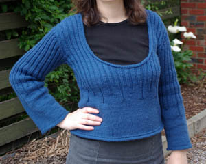
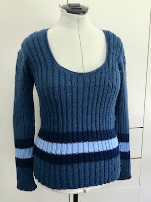
Well, time changes things and not the least body shape. In this case, the length of the jumper just didn’t look or feel right any more. Too short – causing the hemline to sit right at the widest part of my belly. I was tempted to send it off to an op shop, but decided instead to see if my hands could cope with a bit of knitting again. Seems they can, but my neck complains louder so I listened to it and stuck to doing a few rows at a time, knowing I would eventually get it finished.
I didn’t have any more of the yarn, which is discontinued, and the only people on Ravelry who were selling it had colours that wouldn’t suit. Instead, I opted for adding stripes of navy and light blue yarns in my stash. I didn’t have enough of the navy, and Spotlight had sold out of it, but a friend came to the rescue with a spare ball.
The new yarns were slightly thicker, but any change of tension this created would be better hidden with ribbing than plain knitting, so I frogged back to where the ribs started changing to plain knit and started adding ribbed stripes from there.
A few months later I had this:
A ‘new’ jumper. And an itch to knit that I am trying hard to ignore.
It’s a year since I did the Ink-Making workshop. Since then I’ve made several more inks – the main session six months after when acorns were in season and I used some of the leftovers from the Print & Paint with Natural Dyes workshop. One thing I had intended to try but hadn’t got around to was making watercolour paint.
A few weeks ago I finally gave it a try. I decided to use two commercial pigments intended for making paint (titanium white and carbon black), one earth pigment I’d sourced myself (yellow ochre), leftover indigo powder from ink-making and two extracts from the printing workshop (weld and madder).
First up I made some watercolour medium based on a recipe by the Dogwood Dyer. All the medium recipes I’d found used powdered gum Arabic, but I wasn’t able to find it for the ink-making course and I still had some stock solution from that workshop so I used that instead.
Then I got to making paint. The first one I tried was titanium white, which worked perfectly. So I was pretty confident starting out with carbon black. It mixed into a thick, dry paste so I added more medium until it was the right consistency. But even then, when I painted a bit onto some card it could be brushed off once it was dry, so I dug it out of the paint pan and added even more medium.
I was a bit nervous trying the ochre, but it worked out ok. The paint is a bit transparent and slightly gritty, so a little disappointing. The indigo was also ok – so intense that it really needs watering down to appear blue.
The weld had solidified in the jar, so I abandoned it. The madder was still ok, but mixed into a dark, oily brown rather than the red I was expecting. I consulted the Dogwood Dyer’s troubleshooting tips and added more gum Arabic to it, which improved the consistency.
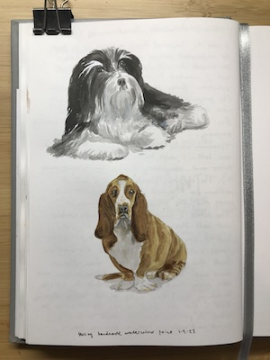
Later I painted some dogs to try them out.
Overall, I found it rather uninspiring. I’m not sure if I was just in a bad mood or something, but I came away thinking making watercolours wasn’t fun or worth the effort. Making dyes was more enjoyable. I may try making watercolour paint again, just to see if it was bad beginner’s luck, but for now it’s just a box to tick on my Things To Try list.
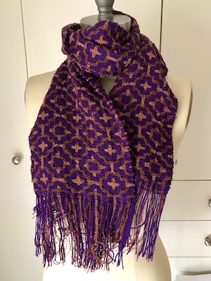
When digging around the stash, matching bouclé yarns with smooth, I stumbled upon a trio that looked really nice together. What seemed like fairly bland reddish-brown and orange bouclé yarns somehow gained a sumptuous metallic gleam next to a purple (blackberry nip) Bendigo Classic 3ply. How could I not weave something with the combo?
A while back I made a draft I called “roses” because of the bright reds I’d chosen for it, but it took only a few tweaks to adapt it to the new colours. It looked great, so I started planning for a scarf, conscious that I didn’t have enough of the orange bouclé for anything larger.
To ensure the orange wouldn’t run out, I wound it onto the warping board set to the length of the scarf, then counted the number of ends. Since that included loom waste, I knew I could plan to warp a little bit over half of the number of ends in orange, since the spacing of it in the weft was the same as the warp. Factoring in these limitations, I knew I’d have a narrower scarf than the ones I’ve been weaving, but still a good size. So warped up the loom and got weaving.
Since I’m weaving almost only on weekends now, and July to October seems like birthday season, the scarf came together at a leisurely pace. I was happy to find these bouclé yarns worked as well as the grey I’ve used in the last three projects. There’s less than a bobbin of orange left, but plenty of the reddish-brown, which wove up nicely and I’d like to use in another DDW scarf.
The last third was woven a bit faster due to wanting to start the next project. A friend gave me some interesting slubby yarn from a scarf that had unravelled. I offered to weave it into a shawl for her, and when I showed her a few examples of items that make a feature of a fancy yarn she was instantly attracted to honeycomb. I’m thinking of weaving a test shawl with some slubby in the stash. Which means my next projects aren’t going to be more bouclé Deflected Doubleweave, but I do hope to get back to it.
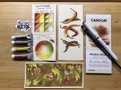
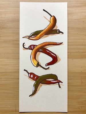
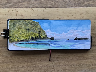
Lately I’ve been practising and experimenting with painting landscapes using watercolour, having used them while on holiday and wanting to be a bit more skilled with them. For references I’ve dug out an old tin of holiday snaps and reference photo rejects. So when the September sketchBOX arrived, with its Autumn theme and colourway, I simply flipped through the same tin for something suitable.
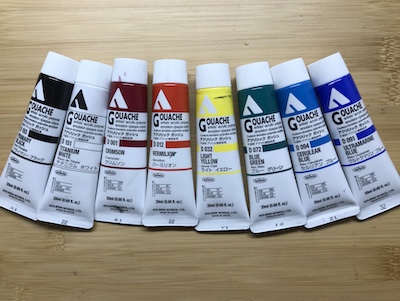
The box contained four gouache tubes, an acrylic paint pen, cream toned paper and a brush.
The first photo that used the colours provided was of chillies. Not sure if this is very Autumnal, but from what I recall of growing them, they were ready to pick around that time of year. The paint went on first then I outlined with the pen.
I wanted to see how well the paper held up to being almost completely covered in paint, so the second reference I picked was of Chinese lantern flowers. It only curled a bit – and I did remove the tape holding it to a board when it was just dry rather than waiting a few hours or overnight. This time I drew in the outlines with the pen before painting the gouache on top.
Everything in the box was good quality and great to work with, though the brush was a tad big for painting most subjects that would fit on the size of card. The size of the tubes would be great for a travel kit, but I’d want a bigger range of colours – or at least one blue.
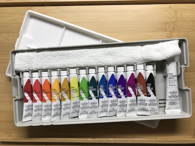
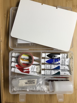
I mentioned in a previous blog post that I took a box of acrylic gouache with me on our holiday, hoping to do some non-sketchbook painting. Whenever I travel I try to reduce the size and weight of my belongings so that I only have a check-in sized bag and a carry bag/handbag of some kind. I got to wondering if there was an acrylic gouage set available with smaller tubes of paint.
A quick search online confirmed that there was, but it was only available in a shop in the CBD. As it turned out, I was going to go past the shop on another errand, so I rang ahead and had it put aside for me. Much to my surprise, the box was enormous.
The packaging said it was a ‘student’ box. Thinking about the YouTubers I’ve watched trying out the jelly gouache boxes that are so popular with young painters, I had an ‘aha’ moment. Those boxes are huge and have chunky lids that clip onto the base. This box was trying to be the same thing. Trouble is, that’s not very practical for travelling.
I took water-soluble oil paints to Central Australia some years back, packed into a neat plastic container. This turned out to be the perfect size box for a pared-down set of acrylic gouache tubes, brushes, acrylic medium, film canister water reservoir and palette. The latter is a sheet of plastic cut to fit. The card stock I planned to paint on would be taped inside the lid when worked on.
Though I tested the multimedia card I intended to use the week before, it wasn’t until I got back that I found it had curled up. So maybe it wasn’t such a bad thing that I only painted in my sketchbook during the holiday. I’ll stick to painting in sketchbooks when I use this set again, which I hope to do soon.
Until a few years ago I’d hardly ever been to an artist demonstration. I saw a couple at the last art society and have been going to most of the new society’s events. I’m finding it a strange but interesting experience.
In one I felt a surprisingly strong repulsion to the artist’s method, not because it was bad or the result wasn’t appealing, just because the method was the complete opposite of mine. In another the technique was fascinating but the materials and tools were just so plasticky. The most recent one inspired me to try the method and medium in my ideas sketchbook. The artist used acrylic ink then drew over it with Micron fine liner. I like the result:
I found I learned something in every demonstration, even the ones I didn’t like. Even when the medium was one I don’t use.
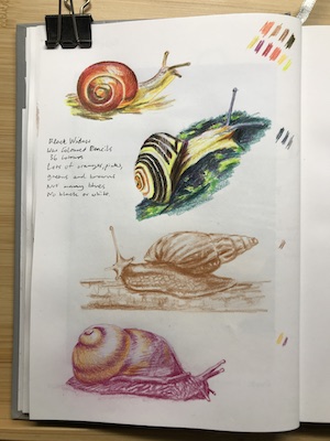
The most recent meeting was a Sponsor’s Night, where the companies that provide prizes and discounts to members came along and demonstrated products. They gave away sets of Black Widow pencils. I’ve been doing a lot of pencil drawing in my ideas sketchbook lately, and was thinking of getting a set of non-water-soluble pencils, so this was great timing. I gave them a go.
They are lovely to work with. Very creamy. My only complaint is that there are very few blues and no black or very dark colour, which is why the lower two snails are done as monochrome and two-colour. When I looked online it didn’t seem to be possible to buy the pencils individually, but when I dropped into the Art Shop they had a small range. However, not many blues again and no black. Other sets seems to have more blues. The set I got is called “Dragon” which has more greens and red-oranges. This sort of curated collections of colour with themes always seem a bit silly to me. When I buy a set of art materials, I don’t intend to only ever make art in one colourway. But then, maybe other artists do.
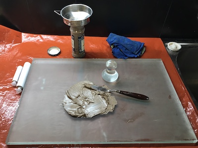
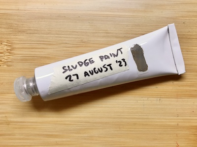
For years now I’ve been ‘recycling’ solvent by letting what I’ve used to clean brushes sit for a while until the pigment settles, then pour off and reuse the clean part at the top. Every few years I’d toss the sludge at the bottom. But it turns out that you can make paint out of it. The colour you get is a muddy mix of every hue you’ve used since saving it, but that doesn’t mean it isn’t useful. Or even beautiful.
I don’t recall exactly where I heard of this, but as soon as I did I knew I had to try it. Some tutorials I’ve seen suggest storing the paint in a jar, but then you have to put cling wrap on the surface to prevent it forming a skin, so I much preferred the option of scooping it onto an empty paint tube.
Once I’d hunted down those, I scooped out the sludge from my settling jar, spread it over my mulling slab and picked out lumps and bits of paint bristle. It was much too sloppy a mix, as it would end up quite liquid once I’d added linseed oil. I contemplated leaving it there for a few days for the solvent to evaporate, but since I was doing this indoors (with an exhaust fan going), I didn’t want to leave fumey, wet paint exposed for long. So I scooped it up into a coffee filter, folded the edges in and left it overnight. The next day I was chuffed to find it had worked. The sludge was now a typical oil paint consistency.
I spread it on the slab again and added a bit too much linseed oil because it came out of the bottle too fast. Next time I’ll use a spoon or dropper. I mulled it for a while, then scooped that into an empty paint tube and folded over the end. There was exactly enough to fill the tube.
The colour is a paleish browny green. I’m planning to use it for sketching in at the start of paintings. It’s not so muddy a colour that I can’t imagine it being useful apart from it being a bit runny.
It also gave me another idea – to premix shades I mix up a lot, like the alizarin-viridian combination that makes a great black, which I use in almost every painting. I have some smaller tubes I can use for that. It’ll save time when setting up to paint plein air.
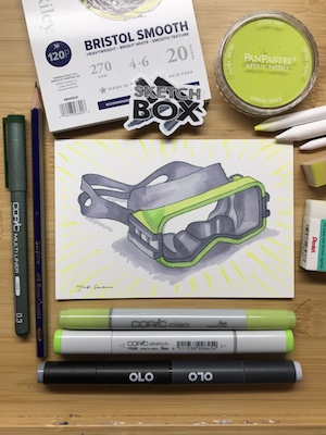
This box arrived while I was on holiday. Though I’d watched unboxings on YouTube and taken note of the strengths and weaknesses of the products, I was a bit stumped as to what to do with them. It wasn’t until I got home and was unpacking that inspirations struck. Putting my unused bathers away, I noticed I still have the goggles and snorkel from a trip I did to Rarotonga in the early 90s. The goggles have that human-designed-but-organic-shape that make for great still life subjects.
They’re actually aqua and black, but easily converted to the yellow-green and grey of the markers.
The PanPastel was an interesting addition. The set would have been sufficient – even generous – without it. I have a black one already, which I bought to use at life drawing sessions but didn’t like. They feel… volatile? I’ve become really wary of art supplies that produce dust since I developed asthma. I can see why artists might be excited by them, though. The pigment is really rich and the blending sponge creates a lovely soft effect.
The rest of the supplies were fun and mostly familiar. I haven’t used Olo markers before. They worked well and similar to the Copic. The eraser is nice. I have another (olive) colour to add to my growing collection of Copic fine liners – what’s not to love about that?
Since I subscribed the themes have included reactive and non-reactive water-based paints, water and alcohol markers, liquid graphite and PanPastel. What’s coming up, I wonder? They’ve done oil pastels, gouache, colour pencils, charcoal, ink and hand-lettering in the past. Maybe they’ll do water-based oil paints. Or print-making. Or scratchboard. Or something I’ve never heard of before.
Initially, I wasn’t sure if I was excited by the July SketchBOX contents or not. I have plenty of portable watercolour sets, water brushes and water soluble pencils and don’t really need more. But then, the reason I have plenty of watercolour sets is I am a sucker for them and the SketchBOX Signature one certainly looked very portable and had good colours. While I have one quality watercolour grade hardcover travel sketchbook already there’s always room for another.
Possibly my hesitation was because July is winter in Australia. Melbourne’s winter is for the more dedicated urban sketcher, and I have not even managed to become a fair weather urban sketcher. Painting with the art society, visiting my mother in aged care and seeing friends was taking up most of my energy, so it wasn’t likely I’d be making a start soon.
Then my mother passed away and things got busy and stressful and I found myself longing for a holiday. We’d abandoned plans for an interstate car trip in Autumn because her health was deteriorating, but now we were free to travel I was too drained for something that adventurous. I just wanted to sit on a beach, read, and maybe do a small painting if I felt up to it.
So we went to the travel agent who was our hero when lockdowns forced the cancelation of a big Europe trip, with nine days until the start of the week we wanted to travel and a vague idea that Lord Howe Island would suit.
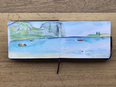
It did. There was only one accommodation venue available, but it was the off season and a room was available. So we took our first flights since 2019 and found ourselves in Paradise.
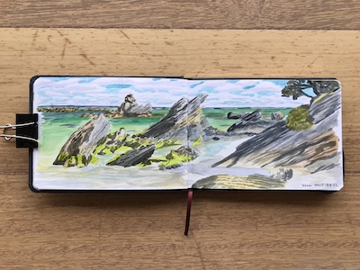
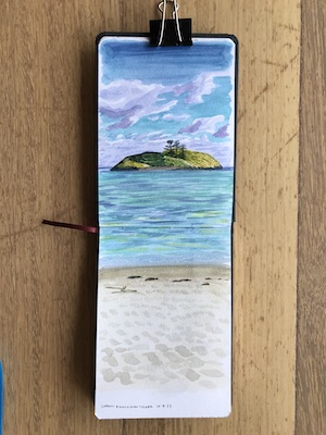
Well, Paradise in winter, when it’s too cold to swim and accommodation isn’t built for chilly nights. However, daytime temperatures were ideal for walking, so we did a lot of that. I did get to sit on beaches, read and do a bit of painting, however, so those aims were achieved.
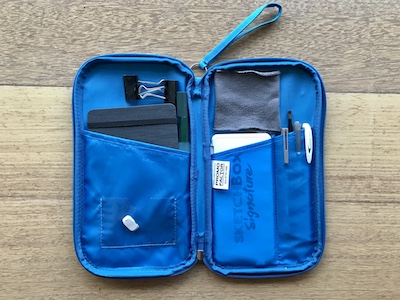
I packed the SketchBOX July supplies, apart from the watercolour pencil (which I was concerned would get jostled about enough to break the lead). They fit neatly into an old travel wallet. The only adjustment I made was sewing along the righthand pocket to make a section that held the watercolour set perfectly. The lefthand pocket was the ideal size for the sketchbook with the water pen tucked in beside it:
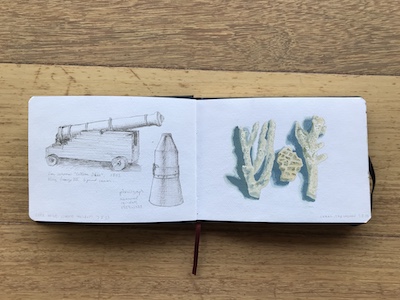
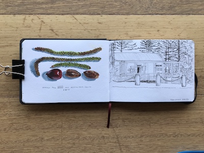
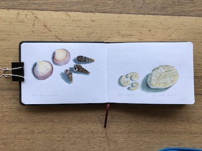
I also took a small plastic box with acrylic gouache paints in it with the idea of painting separate artworks on card, but realised when I got there that most of the plein air painting I do takes two to three hours, and that was a bit much to ask of the other half. Instead I used it back at the room to paint coral, leaves, seeds and shells.
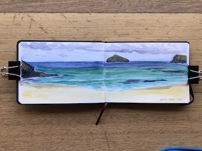
It took me a while to get the hang of the watercolours. Results improved when I worked out that I didn’t like the way water brushes continually feed water into a brushstroke so that the paint dilutes, and makes the whole page more wet than it needed to be. I switched to a normal paintbrush from the acrylic gouache set and was much happier.
Overall, I think it is my favourite of the SketchBOX contents so far. Either this one or the liquid graphite one. When we were considering which island to visit we also looked at Norfolk Island. I’m now keen to go there… but maybe when it gets a bit warmer!
A month or so ago I went to the launch of a friend’s book and talked to a mutual friend who is an editor of a small press publishing venture about my adventures in art. Not long after, she got in contact to ask me if I was interested in doing a book cover illustration for a modern day comic fantasy book based on greek mythology.
When I went through my artwork for the Artist of the Month display some of it was from my days as an illustrator. I felt a mix of nostalgia and curiosity. I’d always wanted to do fantasy book covers, but during the years I ran the illustration business only a few came along, and none for a book. There was an interior illustration of a “friendly dragon” for the children’s education market, black and white internal sf magazine illustrations and one colour cover. I painted cover art for two of my books but my publisher didn’t use them, though they did go on some magazine covers later.
Looking at the art made me wonder if I could try fantasy art again, so my answer to my editor friend’s enquiry was ‘yes!’.
Once I knew what she wanted, and she approved some preliminary sketches, I bought two art materials that were entirely new to me: acrylic gouache and aquaboard.
It might seem crazy to tackle a professional job with a medium I’d never used, but the year of Daily Art gave me confidence that I can work out how to use new mediums pretty quickly, especially if they were similar to what I’d already used. I’d got pretty familiar with both acrylic and gouache during that year. As for aquaboard, I had a small piece from a bag of free art materials given out at an art society meeting, so I had a play with that with the acrylic gouache and liked it.
Both products weren’t available when I ran the illustration business, and they proved ideal for the job. The acrylic gouache dries flat like ordinary gouache, but it can be painted over without disturbing the previous layer. It dries really fast, but the drying retarder I use with normal acrylics worked really well with it. The aquaboard can be wiped almost clean if the paint is still wet, or the paint scratched off if it was dry. All these qualities allowed for the sorts of changes that happen in commissioned illustrations – and I certainly needed them. I wound up scraping off an entire arm and painting it in a new position, and changing the colour of the clothing and skin. I was also able to use the drying retarder as a tinted glaze to change the overall colour of an area.
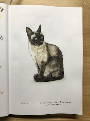
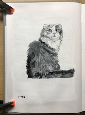
Some days I had a bit of paint and time left over, so I added some art to my ideas sketchbook – preparing the surface for the cat and dog with gesso.
And I realised that I rather like acrylic gouache. It’s easier to use than acrylic, especially mixed with drying retarder. I wouldn’t say it was better or worse than gouache, because their reactive/nonreactive natures simply means they’re suited to different purposes and styles of working, but I may like it just as much.
In fact, I like it enough to buy a ‘student set’ of smaller tubes to take plein air painting or to still life sessions at the art society. It won’t replace oils, but it would be much easier to pack for a plane trip when I next go on a holiday.