This project began with two remnants of corduroy in my stash. One a navy-based floral pin cord with light blue, white and pink in the pattern, the other a plain burgundy with a quite broad cord texture. I searched online for corduroy colour blocking and up came pics of men’s shirts.
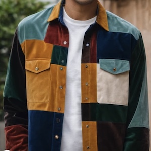
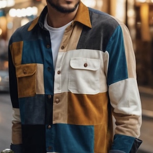
Which I like the look of. The colours and pattern I’m going to use are going to be different, of course. The pattern I’m going to use is one I traced from an old corduroy shirt, but adding pockets and leaving out the waist shaping. The colours are taken from the navy floral fabric: pink, a dusty light blue, a light burgundy, the dark burgundy leftovers from my stash and – because I wanted more than one patterned fabric – a mid-tone aqua-blue with little flowers and mushrooms.
Texture is going to be another factor. The two batches of leftover corduroy are a fine pin cord and an unusually broad cord, so I figured I’d embrace textural difference and have a variety of cord widths. The corduroy I bought to go with them are a mix of medium and fine cord.
I did some sketching…
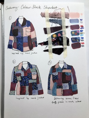
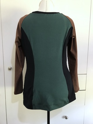
The first two versions were deliberately riffing off the men’s shirts to see what I liked and disliked about the blocking and colour placement. I really didn’t like it having one dark and one light breast pocket – that’s going to matter more on a woman than a man. I also preferred seam lines going along the arms rather than around them. The third sketch is my own choice of seam lines and colour placement, and I like it much better. The arrangement of colours seems more balanced.
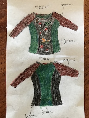
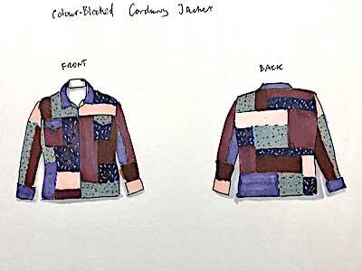
The next step was to tweak the front and work out an arrangement for the back.
Once I was satisfied with that, I spent an afternoon making a tracing of the main pieces of the pattern and creating pieces for the pockets. Then I drew design lines on the front, back, and sleeve, and traced off a pattern piece for each block, adding 1cm seam allowance. Why go to all that trouble? I just knew that if I simply cut up the front, back and sleeve, I’d forget to add seam allowance later. And I’d have had to make two more copies of the front and sleeves, since the pattern isn’t the same on each.
Then I went alway for a long weekend, so there was a bit of gap between making the pattern and making the garment. The latter will have to wait for another post.