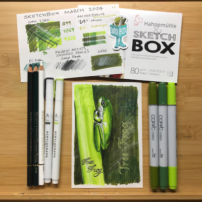
The last SketchBox was waiting for me when we got home from King Island, and I had mixed feelings when I opened it. An echo of the thrill each box has generated, a touch of wistfulness that this was the last one, and acceptance that it was time to end the subscription. I knew what the contents would be, and I wasn’t excited because it contained mainly markers and “Anime” paper. I’m just not that into markers, it turns out. But I wouldn’t have known that if I hadn’t signed up.
Receiving a little box of art materials each month has been a wonderful way to try art supplies I would not normally have chosen to buy – or even been able to in Australia. I have some new favourites, and better versions of what were staples. There were a few duds, but they were few. Overall the contents have been good quality and lived up to expectations.
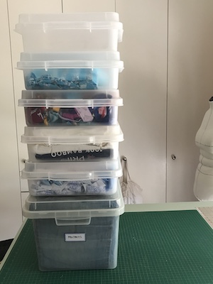
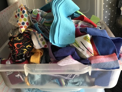
Together, they fill this small caddy. That’s a year’s worth of subscription boxes, and one earlier box I bought separately.
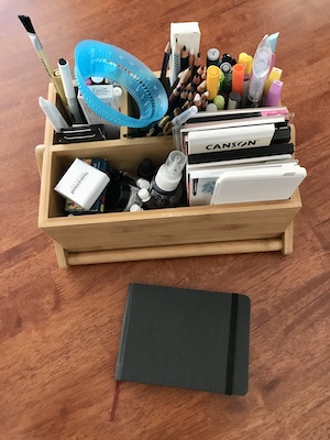
Which is a bit sobering when you consider this is the contents of 13 boxes costing about A$85 (for the box, postage and fees) per month. I don’t regret it, as it has been fun and educational.
Here’s an assessment of all the materials, divided into types rather than box contents:
Paper
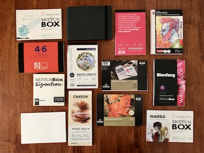
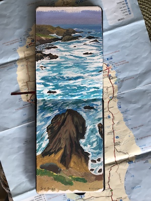
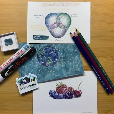
The most useful aspect of the subscription was being able to test different types of paper, seeing what bled or warped, since to do that normally you have to buy an entire pad or package. I was very impressed with the Magnani 104 Pescia White paper, which did not warp at all despite full coverage with ink. The Hahnemuhle Landscape Watercolour Book was fantastic, taking watercolour and gouache on both sides without warping. I’m thinking that having a collection of sample pads to test out new art supplies on is something I need to have and built upon.
Paint
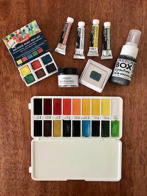
I would have liked to try more kinds of paint. I like everything I received. The little tubes of gouache are lovely and subtle, and the inktense colours are amazingly vivid. The signature paint set for urban sketching is light and slim – practical for urban sketching. Perhaps if I’d continued with the subscription there’d have been a box with oil, acrylic or even casein paint, and maybe little tubes of interesting watercolours like granulating kinds. All of these are keepers.
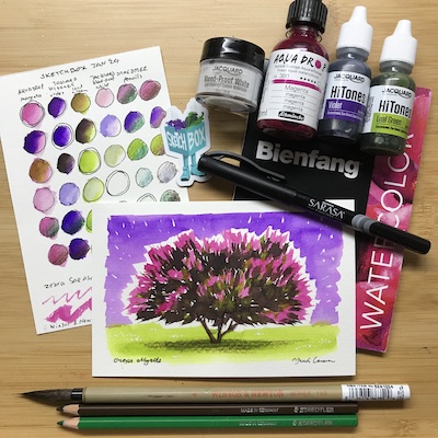
Ink, Liquid Watercolour & Liquid Graphite
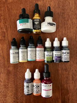
This is the category of art material that was newest to me. The only kind I already had was acrylic ink, and I’d only just bought a set before I subscribed. All of these were fun to play with, though I’m a bit unsure what to do with some of them. The Hero Arts are the strangest, as they appear to be more regularly used for topping up stamp pads. The liquid graphite turned out to be one of my favourite supplies. Especially paired with the gold Hero Arts Glimmer Metallic Ink. I think I’m going to try using most of these as backgrounds under mixed media pieces.
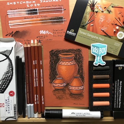
Pastels & Charcoal
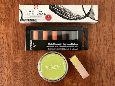
Pastels like me but I don’t like them. Whatever I draw seems to come out better than I expect, but dust they create isn’t great for my asthma and my skin doesn’t like the dryness. I did worry that we’d get lots of these kinds of art supply in the boxes, but they were only in two, and were the main supply type in just one. These will probably be given away to other artists.
Pencils

A good range of types, including graphite, pastel, watersoluble, wax, and plain ol’ drawing pencils. I’ve been drawing with pencils more in recent years, so it was good to try a range of types. These will definitely be absorbed into my growing collection.
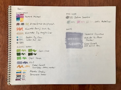
Pens & Markers
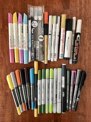
We seemed to get more of these than other categories, though that might just be because they take up more room than, say, pencils. There certainly was a broad variety of kinds. Two-thirds were alcohol-based, one third water-based. Three were white. Two were brush pens. Only four were fineliners. Several were double-ended. The range of colours skews warm, green-yellow-orange.
The Pantone box was my first subscription one and I did hope I’d got the dud box out of the way early! I was not a fan of the Graphix permanent markers for drawing, but they are excellent Sharpie replacements, especially being double-ended. The dot pens were fun but so peculiarly specific that I have no idea what I’ll do with them. I use black fineliners more than any other kind of pen and while we only got one, it introduced me to the Zebra Sarasa fineliner which may become my new favourite. Also, using pink, grey and olive Copic Multi Liners opened my mind to outlining sketches with something other than black.
Brushes
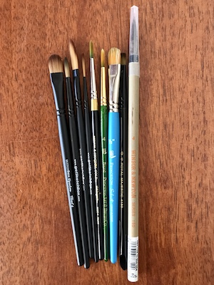
We received a good variety over the year, but I would have liked to try more. I like the quality of the SketchBox signature brushes and they’re the one signature supply I’m tempted to order more of. The larger ones were always impractical for the small paper size, and were the supply I was most likely to swap out for something of my own. That said, they’ll be fine for larger pieces, so all the brushes will join my collection.
Other Tools
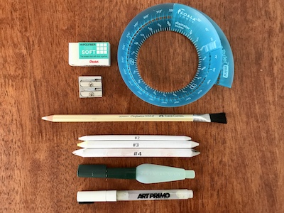
I like that we got a sharpener, eraser and water brush in different boxes over the year, building a set of practical tools. I was surprised there were no smudge sticks in the pastel themed box, and just used what had come with the Pan Pastel. The coolest tool was the Art Primo Hit-N-Go empty marker, which allowed me to make a custom pen colour. The two biggest duds of the year are in this category, however: the Faber-Castell Eraser Pencil which tore up the paper, and the Koala Tools Mini Ring Ruler which made wonky circles. If the eraser pencil works on wood without scratching, I’ll keep it in the garage. All but the ring ruler are keepers. Dunno what to do with it. Op shop?
I did an overall swatch of the supplies, on cartridge paper, and tried reactivating them with water:

And because I was a bit bored watching tv, I roughly counted up the numbers of items in colour categories:
Red & Pink: 13
Orange: 9
Yellow: 8
Green: 18
Blue: 12
Purple: 5
Grey: 16
Brown & Cream: 11
Black: 6
White: 8
Metallic: 3
Green dominated because the last box added six items to the category. Otherwise red, blue and green would have been close to equal.
Now for the award ceremony…
Most used art supply goes to:
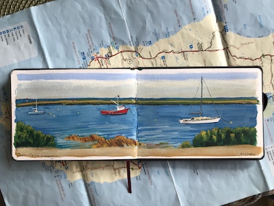
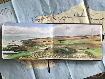
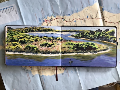
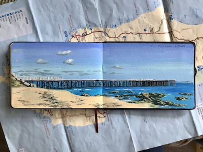
The Hahnemühle Landscape Watercolour Book. It’s been the perfect size for travel sketching. It’s performed brilliantly with different mediums. I’ve nearly filled the sketchbook, which makes it the only supply that I’ve come close to using up.
Best new-to-me art supply goes to:
Liquid Graphite. Colour me surprised, but I made four artworks with this and three turned out really well. Since I don’t like dusty art supplies, having something I’d normally avoid available in a safe, liquid base is always nice. But the extra treat was that it behaves more like a watercolour, and dries shiny.
Most surprising art supply goes to:
Intense paint pans, because it turned out you can paint fabric and the result is permanent when dry!
Best value art supply goes to:
The urban sketching box. The SketchBox Signature watercolour palette is so practical, and the sketchbook such good quality. I’m not a fan of water brushes, but this one performs well. And the Copic Multiliner is a nice shade of grey. I’m using the old meaning for ‘value’ here, judging it on how likely I am to use the contents. Getting something cheap is not good value if you don’t use it.
Supply I most want to find an Australian supplier for goes to:
The Zebra Sarasa fineliner. I’ve heard their brush pens are good, too.