The last SketchBox post I wrote was published back in November, but I completely forgot to write about them since. Something must have happened in December and January to make me forget about them until now. I wonder what that could be?
Hmm.
Well, better late than never. Here’s my report on the December, January and February boxes.
December:
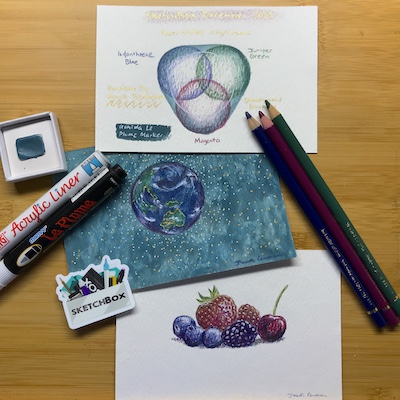
I was expecting a Christmas-themed box of green and red so I was relieved when the colour range was broader. You could make a red/green dominant artwork using the pencils if you wanted to, but the blues freed you from seasonal overload.
The prompt was “snow globe” and, with the box arriving well after most recipients who are going to post or vlog about them, there were plenty of literal snow globe artworks already. I went for The Globe instead. Then some fruit so I could experiment with getting yellow by scribbling on the palette with the gold pen and painting with the residue. I like all the supplies, and the Stoneground Gouache – the hero of the box (according to vloggers) – is lovely to paint with.
January:
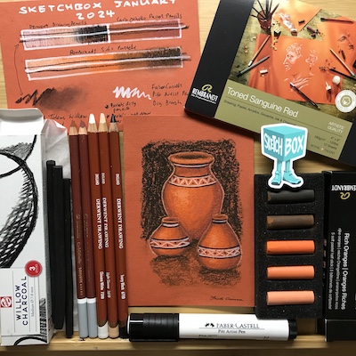
It was winter over in the US, where SketchBox comes from, so the box was full of brown and orange shades. Here in Melbourne it was warm and humid. Maybe that’s why I thought of south to central American design terracotta pottery – I was longing for some dry heat. The prompt was ‘flame’. Pottery comes out of flame. Is that reaching too far?
I was expecting there to be a box with pastels eventually. I love and hate pastels. I have come to hate dust-producing art materials that set off my asthma. They seem to like me though – I get good results from them and am rather chuffed at how this came out.
This was definitely one of those boxes that seemed to have a smidge bit too much in it. The charcoal wasn’t really needed. The white pen is great, but the white pencil went better with the other supplies and the box didn’t need two whites. I think I’d have liked some smudging tools instead, or a kneadable eraser.
February:
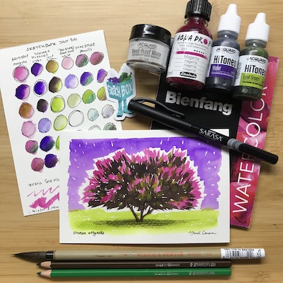
It’s easy to imagine these colours were inspired by a late-winter northern hemisphere longing for spring. But they are very garden-like regardless of season. At the moment my crepe myrtle is in bloom with magenta blossoms, despite (or perhaps because) I pruned all the branches off ready to dig it out of the ground because it had looked mostly dead. It doesn’t look this good, though! The prompt was ‘fantasy’, so this a fantasy of the crepe myrtle I wish I had!
This was the first time I redid a SketchBox artwork. The first piece became very muddy after I added another layer of watercolour and discovered the first one was not as dry as I thought. I also did a piece where I puddled, dropped and splattered the supplies, but didn’t like the result.
I think I had these false starts because there was quite a bit of scope for different methods and styles of artwork in this selection of art materials. The bleed-proof white made lovely opaque hues when the liquid watercolours were mixed in. The pencils added texture and interesting gradients when used under or over the watercolours. But I felt the vivid saturation of the three watercolours was the most exciting aspect of the box.
–
I have one more box to go to reach a year’s worth of SketchBoxes, and I’ve ended my subscription after that. That includes one I ordered separately, not as part of the subscription. It’s been a great deal of fun, and I’ve tried art materials I’d never have bought, or ones I use but different brands to what I usually buy. I’ve tried combining materials in new ways, too. There comes a point when the novelty wears off, though. There are only so many kinds of art supplies so eventually the types will start to repeat (and I certainly don’t fancy getting another box of markers!). I’m planning to do a summary of the twelve boxes after I receive the final one, choosing the most and least favourite materials, and reviewing the artwork I did.